Sunday, 2 July 2017

Graphic Narrative

Here is the storyline to my Graphic narrative:

The story begins with a young boy who is all alone on a remote island , he has lived here all his life and how he got here is unknown , his existence is unknown until one day a fleet of journalist stumble across this island . It took the fleet of men 2 months to arrive at the remote island as it was proclaimed a myth of legends, until it was discovered by them. The main character Russ was very unhappy about the journalist coming on to his island and destroying the wild life as they done checks on these exotic unknown plants. The island is believed to be millions of years old. Once the journalist began to destroy the wild life Russ the young boy with supernatural gifts enraged and went out on a furious rampage tearing the journalist apart with his super strength and sinking their boats with his abilities to control wind. The journalist knew there was some type of danger on this island so they came prepared with advanced weapons. A fight for the island began as Russ deflected the rockets and punched holes in to the journalist. This war could only end one way , the journalist had one last option call in the worlds top scientist . When the scientist arrived he had come to the realisation that Russ the boy on the island was a boy that had been brought back to earth when he  was traveling through different dimensions as he attempted to experiment on Russ to gain his super powers however Russ escaped and fled. The scientist was unaware of his whereabouts until now. He ran towards Russ to convince him things are alright and to return with him to be a normal person, but Russ was very angry at the scientist for taking him away from his dimension so he pulled out the scientist heart and ran off back in to the bushes. All the journalist were dead and the island was destroyed from the war. Russ whereabouts are still unknown till this day...

THE END.


PAGE 1


Thursday, 22 June 2017

Feedback Notes From Pitch


Treatment STOP MOTION


Stop Motion Pitch


Stop Motion Questionnaire

After presenting my stop motion to my class i handed out this questionnaire ...                                                                                                                                                                                                                               FEEDBACK ON STOP MOTION


Q1. Was the length of the stop motion appropriate? If NOT please explain how it could Have been improved.


 Q2. Was there a clear story line? If NOT please explain how it could have been improved.


Q3. Any other improvements that could have been made?
Q4. Do you feel that the STOP MOTION characters were detailed ? If NOT what tips could you give

Q5. Was the soundtrack effective? If NOT what tips could you give

Reflection / Evaluation

 After completing my graphic narrative i am going to reflect and evaluate what can be improved...                                                                                                                                                                              NARRATIVE STRUCTURE                                                                                                                                                                                                                                                                                I went for a simple graphic narrative structure , the first stage i described the main participants, the second stage i introduced the problem and other complications in the situation which has an effect on the main character.The third stage is a resolution to the problem however i added a plot twist making the structure a multi-strand narrative with a closed structure.The fourth stage is the denouement , the aftermath of the response that makes clear the success , partial success or non-success of the situation.                                                                                                                                                                                                                                                                                                                         COMPONENTS                                                                                                                                                                                                                                                                                                           The comic opens with the main character Russ laying on the beach on his island , he is then disturbed by a very loud crashing noise he goes to check it out and to his surprise he sees hundreds of journalist boarding the island. The conflict within the comic is very extreme , a lot of blood and gore is included for this reason i have made the target audience 16+. The conflict all begins once the journalist begin deforestation to Russ island. The journalist believed to resolve this situation they would call in a scientist who would be able to find this super beings weakness little did they know that the scientist was the one who brought this alien to Earth. The climax built when the fight for the island began and escalated once it was announced that the scientist  knew Russ . The death of the scientist intensified the climax.                                                                                                                                                                                                                                                                                      Here is my reflection and evaluation of my graphic narrative called "BOY O BOY ".

Considerations

Target Audience 

When creating my graphic narrative there were a number of things i had to take in to consideration the target audience being one. As i have created my own graphic narrative and not adapted a storyline from an existing i have my own target audience. Due to my graphic narrative containing a lot of violence and such a serious story line i have made my target audience 16+ as it contains adult content that may be deemed unsuitable for minors. Content such as swearing , blood and gore will be included within this serious graphic narrative. I aim to achieve a very intense serious story line that  leave the audience wanting more. 


Length 

When creating my graphic narrative another thing i would have to take in to consideration is the length of the story line . The reason for this is so its not too long or too short. the perfect  length i believe is two pages this would allow me to give a detailed story without it being too long. Short sentences will be used when describing scenes and for dialogue. Making it simple and quick when my audience are reading the graphic narrative.


Digital / Paper 

When creating my graphic narrative i had to take in to consideration which platform i wanted to produce it on whether is was using a programme such asphotoshop , or simply drawing it out. Although i am not the best artist i believed it would be easier to draw my graphic narrative and simply colour it in. This also allowed me to add small detail that would be hard to achieve on a computer programme . Drawing also allowed me to explore without having to repeat steps.

Health and Safety


HEALTH AND SAFETY IN A GRAPHIC NARRATIVE STUDIO 


In this post i will be researching health and safety requirements/regulations about producing graphic narratives in a professional setting such as a studio.


Here are some hazards and potential harm that could come in a professional graphic design studio.

Manual Tasks - Muscular strain from overexertion movement this could occur when drawing.

Gravity - Falling objects , Slips and trips can cause bodily harm or death

Electricity - This could be a fire hazard and it is a source of ignition it could also cause shock , burns or death electrocution .

Extreme Temperatures - Due from the lighting this is a a heat source and can cause a fire .

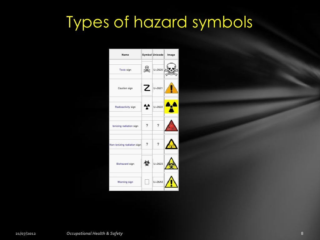
Knowing all the hazard symbols is a key skills so you are able to identify a hazard.


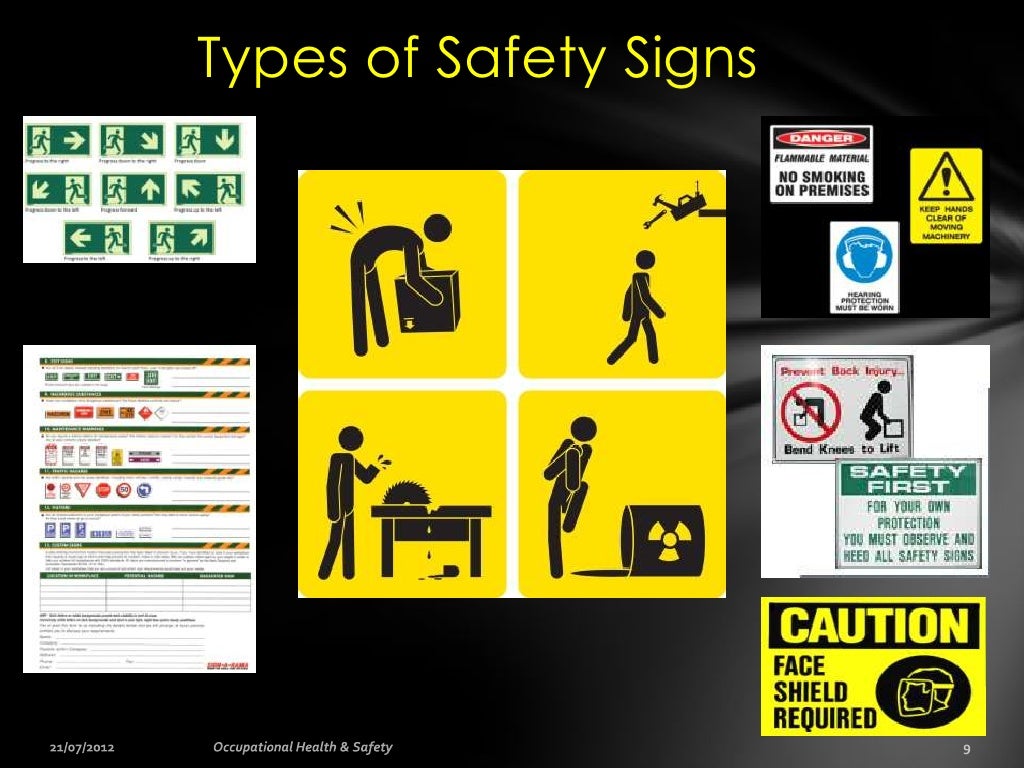
Types of Safety Signs Below are just some examples to watchout for:•   Slippery floors.•   Open cabinet / desk drawers.•   Upper back and neck p...

All equipment within the study will go under a Equipment Safety Check . To maintain safe environment equipment need to be maintained on a regular  basis. Once they have gone through the safety check they will be labeled and dated for the next check up.


FROM THIS SOURCE : http://visualartists.ie/the-manual-a-survival-guide-for-visual-artists/protecting-yourself/health-and-safety-in-the-studio/

I FOUND A RSK ASSMEN THAT SHOULD BE CARRIED OUT IN A PROFESSIONAL STUDIO TO PREVENT ANY TYPE OF DANGER THAT COULD OCCUR


Risk AssessmentA risk assessment identifies the hazards in your workplace and evaluates the risks posed by these hazards. In order to fully comprehend the language of the legislation and to be able to draw up a risk assessment, it is helpful to understand the common terms used throughout – hazard, harm and risk.


  • A Hazard can be defined as anything that has the potential to cause physical injury or damage to health, the environment or to property.
  • Harm is the adverse effect on an individual that may result from exposure to a hazard
  • A Risk is a measure of the probability of harm being caused and the severity of that harm.


Carrying Out a Risk Assessment
The Health and Safety Authority provides a systematic guide to carrying out a risk assessment.
* Analyse your studio or workplace. This may involve listing all the activities carried out in your studio, drawing up a diagram of your space and mapping the location of equipment such as computers, sinks, radiators, shelving, kilns etc

* Identify the hazards associated with your work activities. For example, electrical hazards associated with untrunked cables which may cause tripping or falling, chemical hazards associated with toxic materials, hazards that are associated with stone work – dust inhalation for example. Textile dyes are particularly hazardous to skin and photochemicals used by photographers are associated with skin and respiratory diseases. Some hazards may not seem so obvious such as unsecured shelving, the glare from PC monitors, for example, but even the chair that you sit on, if incorrectly adjusted, can cause back injury.

* Rate the risk level associated with each hazard. To do this you need to evaluate the likelihood that injury might occur and the extent or severity of the injury. This assessment of risk is a question of judgement – you yourself must form an opinion. If you are unsure of the risk associated with a particular piece of equipment or chemical; it is up to you to find out by contacting the manufacturer or reading the label or safety manual.

Contemporary Genres / Forms Case Study ( STOP MOTION ANIMATION )


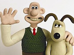
WALLACE AND GROMIT CASE STUDY  Wallace and gromit.jpg

GenreClay animation
Comedy
Adventure
Suspense
Written by
  • Bob Baker
  • Nick Park
  • Steve Box
  • Mark Burton
Directed by
  • Nick Park
  • Steve Box
  • Merlin Crossingham
Starring
  • Peter Sallis (1990–2010)
  • Ben Whitehead (2009, 2011–2013)
Theme music composerJulian Nott
Opening theme"Wallace and Gromit"
Composer(s)Julian Nott
Country of origin  United Kingdom
While carrying out this case study i found out that the characters Wallace and Gromit were crafted out of plasticine. This allow the creators to use sculpting tools for details and move the characters when taking shots to create the stop motion.


Wallace and Gromit is a British clay animation comedy series created by Nick of Aardman Animations. The series consists of four short films and a feature length film.


MCCOYS TV ADVERT 


   Image result for mccoys stop motion advert
The crisp company  Mccoys created a stop motion advert , although it is crisp from the advert I was able to spot characteristics that the director has given to packet with a voice of a grown man. The animation is a perfect duration of 41 seconds. In this short clip you are able to identify the bad and good characters, the crisp packet will not let the bad crisp enter the packet showing the quality of Mccoys. The sound effects of the crisp packet crunching helps create effect.


KUBO AND THE TWO STRINGS  TRAILER

Image result for kubo and the two strings trailer source: https://www.wired.com/2016/08/art-of-kubo-video/


Kubo follows the fantastical quest of a young boy in ancient Japan an ambitious move for the stop-motion studio. Not only did Laika take on the always tricky challenge of animating water, the team also had to integrate that with practical puppets and sets.
Epic and action-packed, Kubo and the Two Strings is an animated adventure movie with human and animal characters, magic, monsters, and an emotional family story at its core. And Laika, the studio behind the film, made it entirely using 3-D-printed puppets and the latest CG.

And the sweeping story, about a boy on a quest, is full of the unusual. The biggest challenge of making Kubo, says producer Arianne Sutner, "is the sheer scope of it." Unlike the studio’s previous films, this one is almost all exteriors and many outdoor locations, from the opening scene in the boat to the public square, into the woods, and under the sea. “It’s a big, exterior, road movie,” says Sutner. “An outdoor adventure with David Lean proportions. And we wanted it to be really cinematic, even in stop-motion animation on


Monday, 15 May 2017

Finalising Story / Narrative

Here are some of the notes i have made when working towards a narrative. These notes are  brief idea of the narrative and will be worked upon along the way making the narrative clear and complete .


Thursday, 4 May 2017

Case Study - Graphic Novel / Comic Book Artist


STANLEY MARTIN LIEBER 

Basic Information 

Stan Lee is an American comic-book writer and is best known for being the president and chairman of Marvel Comics , this also meant that he is a writer , editor , publisher ,media producer , television host and actor . Stan Lee was born on December 28th 1922 and is now at the age of 94 in his lifetime he has won a number of rewards some of them are , The will Eisner Award Hall of Fame and Jack Kirby Hall of Fame.

Visual Style 

Stan Lee has a very cliche visual style his comics style conform to the stereotypical hero comic however what makes his style different is the twist and unpredictable events that happen within the stories in the comic , however the graphic design and characters are very cliche yet have that little bit of unpredictability remains within the characters.
On the left hand side is a comic called "The Walking Dead " written by these three men Tony Moore, Robert Kirkman and Charlie Adlard.  The Walking did is a science-fiction novel about a group of friends and family surviving a zombie apocalypse. The front cover of this magazine has been sketched with the same amount of detail as the magazine on the right . The Spider Man magazine written by Stan Lee has been sketched and presented very much like most magazines making its appearance cliche . 

Stan Lee uses Marvel comics to present his work but show to his audience his work may look cliche but it is completely different to other comic stories due to his creative mind set he proves that his unpredictable strories keep his audience on the edge of their seat begging for more.    

How Stan Lee Presents Narrative Through Imagery

Stan Lee's comics have detailed drawings this helps the audience build a more detailed image of the story being told this also makes them feel more involved in the story . In Stan Lee comics there is very minimal text unlike some comics with less reading to do the audience will be able to view the pictures and see the story unfold. The imagery in Stan's comics are mostly coloured amplifying the detail have a greater effect on the reader and keeping them engaged.

CASE STUDY 

Marvel was found by Martin Goodman in 1939 , the amazing Stan Lee is an American comic book writer who wrote Marvels stories he also wrote many more such as DC.

  • In 1939 Martin Goodman - Timely Productions
  • 1950 Alas Comics 
  • Late '50s and early '60 - Era of Heroes ends 
  • DC Comics pulled ahead 
  • Stan Lee Brings Fantastic Four as the first super hero team 
  • Marvel Universe
Marvel is one of the worlds most popular Super Hero related companies many films , movies and series are viewed my thousands , Marvel has a wide variety of target audiences and ways of publishing . Marvel markets through Movies , Games , Merchandise , and adverts such as billboards etc this not only expands their audience but also helps the company keep flowing.

The company is a wholly owned subsidiary of The Walt Disney Company, and is mainly known for its Marvel Comics, Marvel Animation, and Marvel Television units.


Monday, 27 March 2017

Graphic Narrative Production

What is graphic narrative ?
My definiton of graphic narrative is telling a story using drawings and pictures .

MANGA

A style of Japanese comic books and graphic novels, typically aimed at adults as well as children.
Manga is usually very violent however some that are aimed at children are not . Manga are comics created in Japan or by creators in the Japanese lanuage conforming to a style developed in Japan in the late 19th Century.


GRAPHIC NOVELS 

A graphic novel, is a novel I'm comic strip format and published as a book . Graphic Novels are normally targeted towards teenage boys because of their focus on the superhero genre. Another target audience are those with a second language and those that are very young. "graphic novel" is applied broadly and includes fiction, non-fiction, and anthologized work.


COMIC BOOKS / STRIPS 

a sequence of drawings, either in color or black and white, relating a comic incident, an adventure or mystery story, etc., often having dialogue printed in balloons, and usually printed as a horizontal strip in daily newspapers and in an uninterrupted block or longer sequence of such strips in Sunday newspapers and in comic books. Comic book strips have a wide range of target audience from children to adults. 


PHOTO-STORY 

A strip cartoon with photographs in place of drawings. This is the modern way of graphic narrative without drawing. 


CHILDREN'S BOOKS 

Googles definition of children's books: There is no single or widely used definition of children's literature. 15-17 . It can be broadly defined as anything that children read or more specifically defined as fiction, non-fiction, poetry, or drama intended for and used by children and young people. Children's books have been being published for many years.


GRAPHIC NARRATIVE 

Tuesday, 14 March 2017

Evaluation

Here is a short evaluation of my stop animation , in this evaluation i will briefly cover the research , pre - production , planning , preparation and production.


When beginning this animation , i decided on the genre of my animation i went for a vulgar gothic theme. I had gathered this idea from my research which i carried out on Tim Burton while carrying out research on him i covered his previous ideas where i was able to select key ideas such as the design of my background to the appearance of my characters. While  carrying out my research i also learnt useful ideas such as the best materials to use when designing my characters and the perfect tools to sculpt them for detail.

After this my next task was to create a pre production animation as it would help me become familiar with the programme i was using Called ISTOP MOTION it would also help me practice on my sculpting skills on these characters . If you take a long on my blog you should be able to find my pre production animation called " Elephant and Caticorn Fight". while carrying out my pre production animation i worked with class mates which would take the shots as i moved the characters while doing this i learnt that i had to be very patient and precise to produce a successful animation.

The planning stage was very simple and straight forward due to the detailed research i carried out i was very confident with my idea and knew what i was aiming to produce. To help with my planning i produced a mind map and a story board . These give me a basic visual of my ideas and the story line of my animation once i had the story line all i had to was put it together .

The prepping of the animation was basic i set out a cardboard box painted the walls white i also created a background on a rectangle piece of cardboard i simply slide this down the background to change the setting. I tapped my set down to the table to make sure when i came back to finish my work nothing had been moved out of position . I was well prepared however it was difficult sometimes as the camera would not always be left in the same position.

 The final stage was the production of the animation , when carrying this out i moved the character in to position took the shot moved the character once again and took the shot i repeated this. To achieve a high quality stop animation patience is key aswell as this precision is important to create a smooth flow I'm movement.

Gathered from my audience feedback my strengths are :


  • The main character went through different settings 
  • The perfect amount of frames to make it fluid in movement. 
On the other hand my weaknesses are : 
  • Sound effects or some type of backing track should be included 


This is my finished evaluation to my animation - HOSPITAL MADNESS 


Production Ideas/ design

Once i started producing my animation i did not follow the story board as along the way i had come up with new better ideas.


Audience Feedback